← Back
RELATIONS · SNELSTART

From a data form to a 360° view of every relation.

In snelstart, a "relation" was literally just a form to type in a customer’s data — name, address, bank details, and nothing more. I turned it into a full 360° overview: insights, recommendations and cross-domain data in one place, so the entrepreneur sees everything that matters about a customer — and what to do next.

ROLE
UX/UI Designer
TOOLS
Figma, Miro
STATUS
Live
YEAR
2025
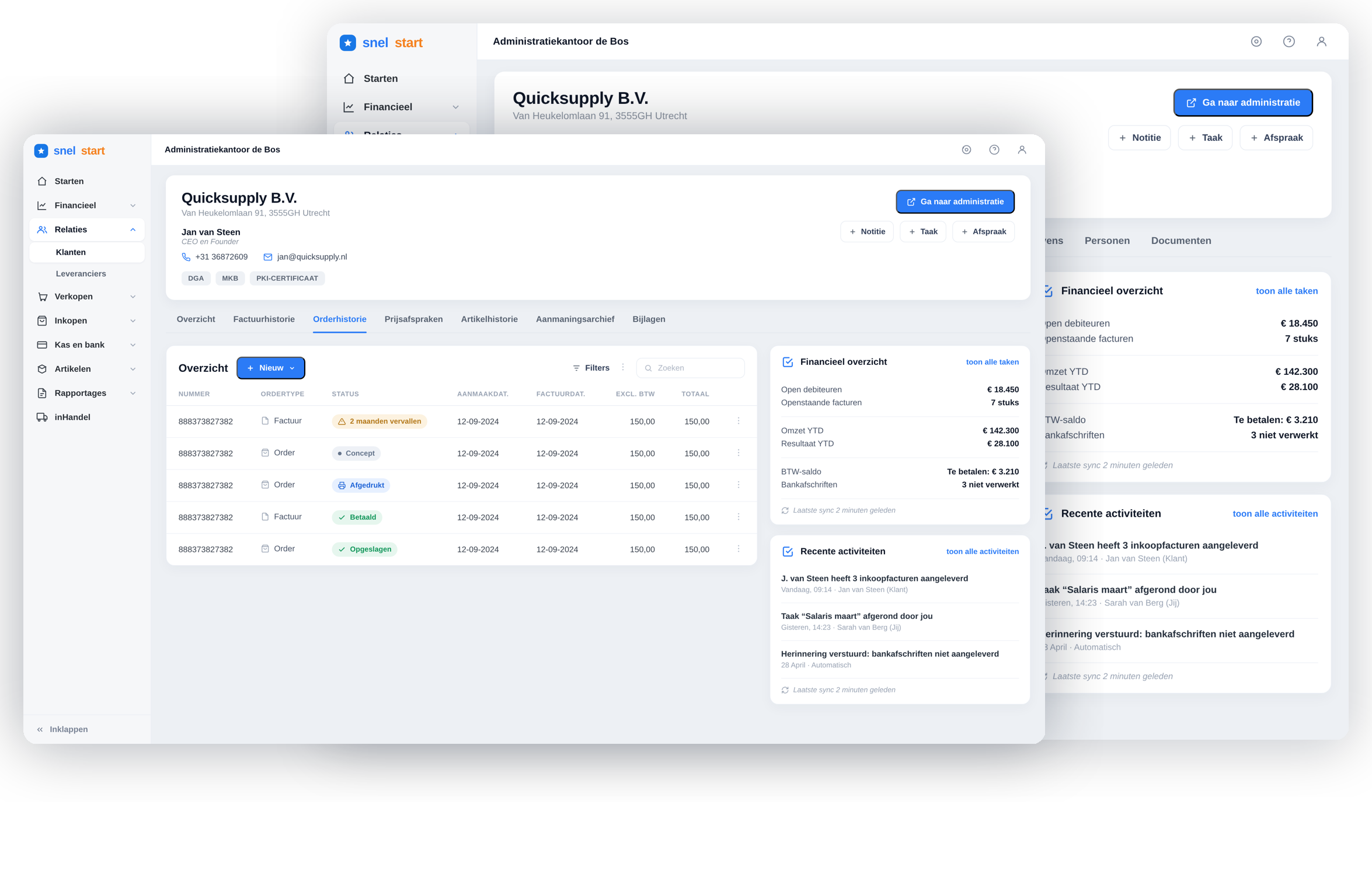
The relation overview in two tailored versions — ondernemer and accountant
One relation — a view for the ondernemer, and one for the accountant
WHY IT MATTERED

A relation is the centre of the work — not a form.

Almost everything an entrepreneur does in snelstart connects to a relation — a customer or supplier. Yet the relation itself was nothing more than a form: a modal to type in a name, address and bank details. Everything that tells you how a customer actually behaves — open invoices, quotes, activity, whether they pay on time — lived scattered across other parts of the product.

To understand a single relation, users had to hop between screens and hold the picture in their head. Making the relation a real home — with insight and context — meant fewer detours and better decisions, right where the work happens.

IN LINE WITH SNELSTART’S MISSION

More than software — a guide that helps entrepreneurs grow.

SnelStart’s vision is to let entrepreneurs grow — and it frames its role as a sherpa: not just a signpost, but a guide that travels with the entrepreneur and proactively advises. A customer trapped in a data-entry form can’t support that. The overview turns the data SnelStart already holds into knowledge it hands back — right where the work happens.

Help the entrepreneur grow

Centralise every signal about a customer — invoices, activity, payment behaviour — so decisions get made on the full picture.

Turn data into advice

Bundle the data SnelStart already holds and give it back as clear insight and recommendations to act on.

Proactive, not a signpost

Surface what needs attention — a customer who pays late or scores poorly — before it hits cash flow.

THE BIGGER PICTURE

A bookkeeping package becoming a total solution.

snelstart started as a boekhoudpakket, but it's growing into a totaaloplossing — adding new ventures and products across different markets. The relation is the entity everything connects to, so it has to carry far more than contact details — right down to the smallest business.

KYC your own clients Fiscal entities New ventures Cross-market products Down to the smallest entity
THE PROBLEM

Everything was there — just not together.

Trapped in a modal
A relation was just a pop-up of editable fields — no room to show more.
Data, not insight
Users saw raw fields and had to interpret the state of a relation themselves.
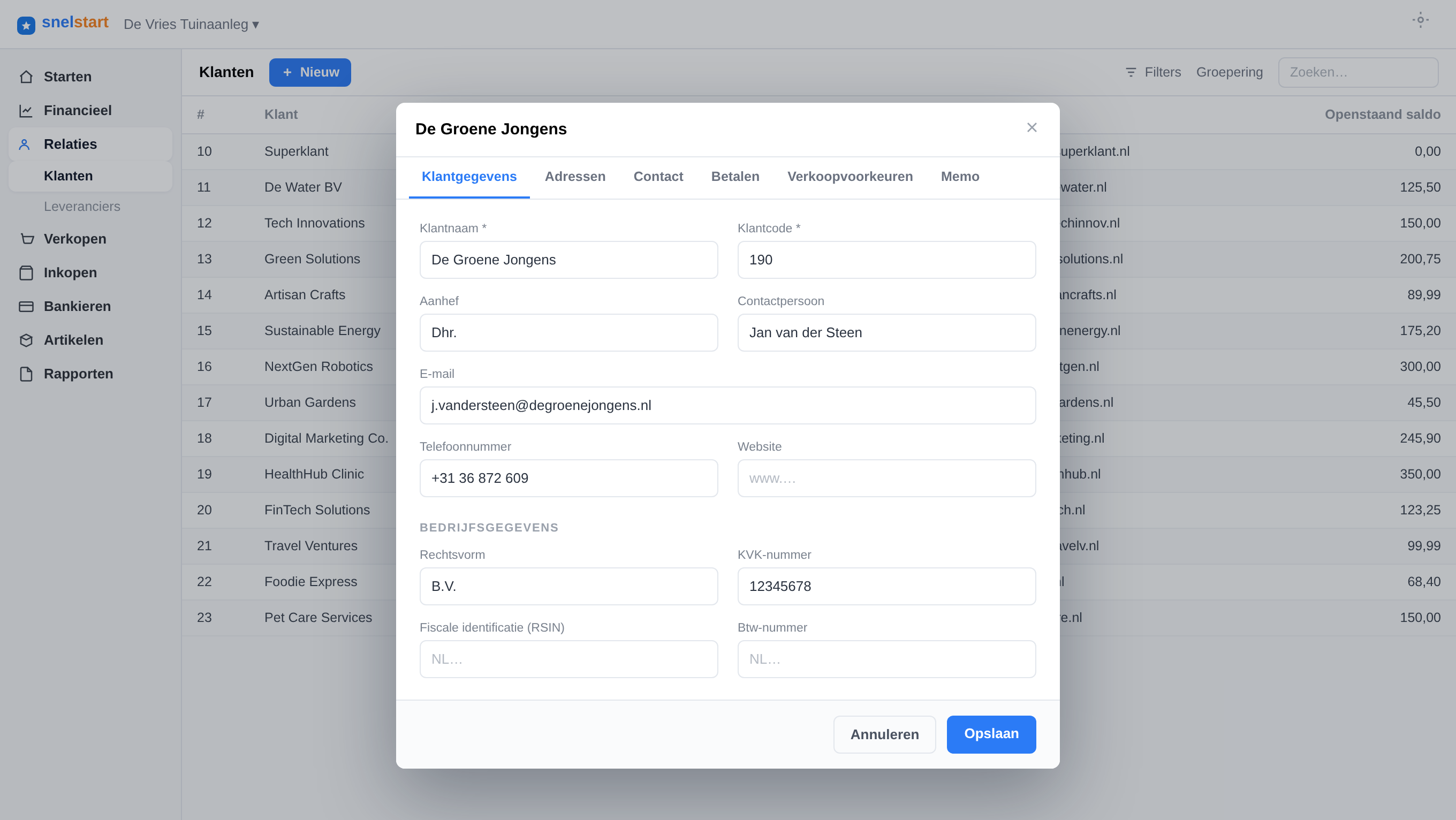
The old relation: a flat customer list with a data-entry modal
Before — a list, and a modal to fill in fields
Scattered across domains
Invoices, quotes and activity for the same relation lived in separate places.
No next step
Nothing pointed users towards the most relevant action to take.
RESEARCH · WHAT USERS TOLD US

I asked 48 users what a relation should be.

I ran a survey with 48 SnelStart users across SnelStart 12, Web and Polaris to see how the relation screen is used today and where it falls short — then compared the findings across three roles.

Today it’s used mostly as a lookup and admin screen — rarely as the overview people actually needed.
48 users
WHO TOOK PART
Entrepreneurs59%
Accountants31%
Bookkeepers11%
The shared base layer

Across every role, the same four needs came back — the base layer that delivers value for everyone, so it earned first priority.

Findability & search

Search felt limited and unreliable — users wanted filters, sorting and search on identifiers.

Overview at a glance

Even editing basic details meant hopping between separate tabs.

Context & history

Activity, history and documents were missing from the relation itself.

Flexibility

A clear need for notes, labels and custom fields per relation.

Entrepreneurs

Practical: overview, then act

  • A quick read on where a customer stands
  • Act fast — chase a payment, open a quote
Accountants

A control & progress instrument

  • History & context across multiple years
  • Status & progress: periodic tasks, VAT status
  • Link and unlink invoices to payments
  • Reliable KVK / master data
Bookkeepers

Everything together, no extra steps

  • Open invoices visible at a glance
  • Documents and attachments in place
  • Notes and client correspondence
  • Multiple contacts & a logical order vs invoice
APPROACH, IN SHORT

Map what a relation touches, then bring it home.

I audited every place a relation shows up across snelstart, learned which jobs users came to it for, and shaped an overview around the answers people actually needed.

Cross-domain audit User & stakeholder input Information architecture Rapid prototyping Validation with users
1
home for every relation
instead of a scattered picture.
4+
domains, one view
invoices, quotes, activity & more.
0
detours needed
the full picture, in place.
WHAT WE SET OUT TO DO

One page, the whole picture.

01
A 360° overview
Give every relation a real page, not a modal.
02
Insight at a glance
Summarise status and behaviour, not just raw fields.
03
Bring domains together
Surface data from across snelstart via clear tabs.
04
Recommend next steps
Nudge the most relevant action for this relation.
TAILORED TO WHO’S LOOKING

One relation, two tailored views.

The same relation is opened by very different people. An entrepreneur wants to act — chase an invoice, start a quote, keep sales moving. An accountant wants control — deadlines, tax returns and the financial health of the client. So the overview adapts to who’s looking, on one shared foundation.

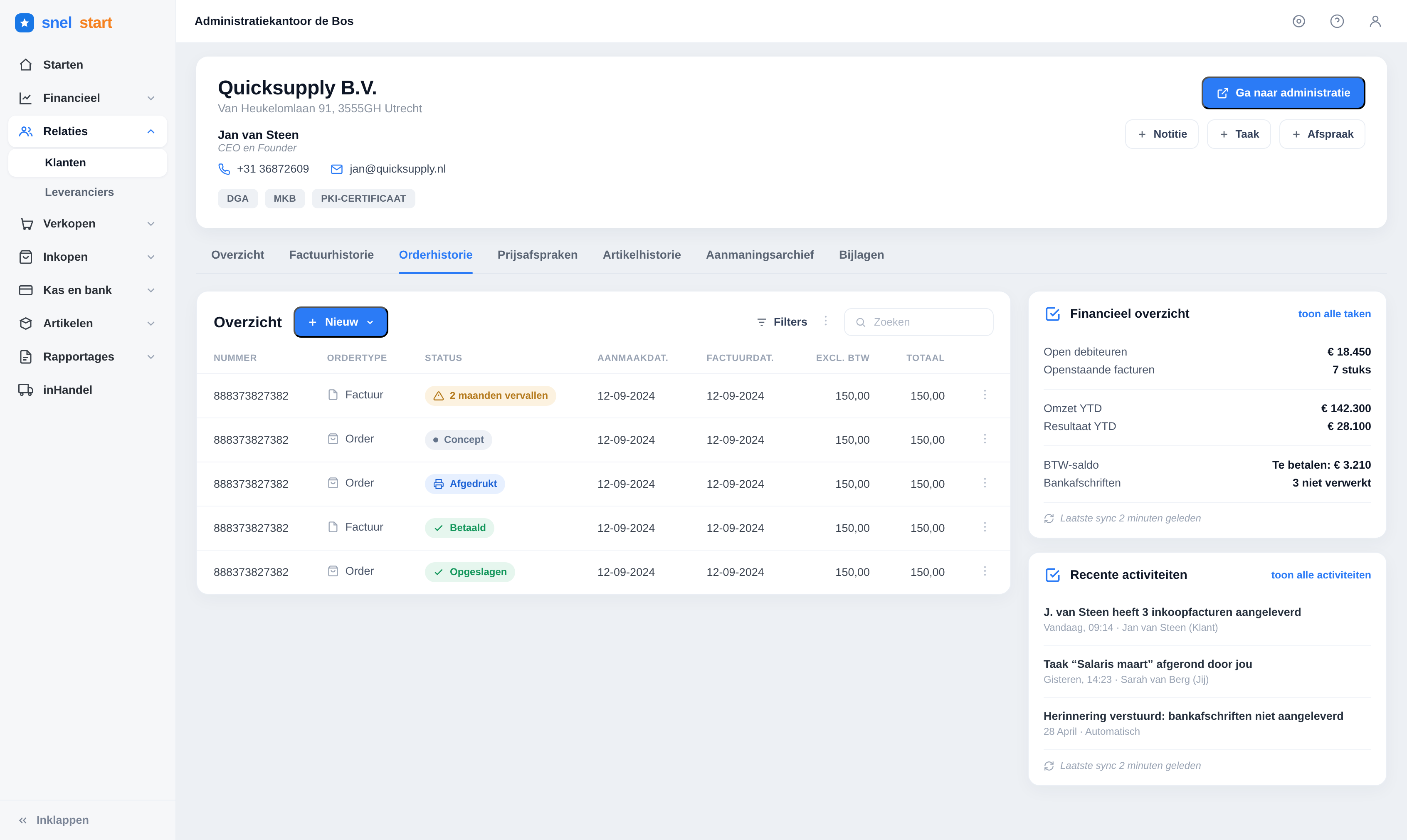
The relation overview for entrepreneurs — order history and activity
FOR THE ONDERNEMER · ACTION & SALES

Built to act.

The entrepreneur lands on what moves the business forward: orders, invoices and what needs chasing — with the next step one click away.

  • Order & invoice history front and centre, with clear status
  • One tap to start a new quote, order or invoice
  • Open items and late payers surfaced up front
  • Quick actions — note, task, appointment — without leaving the page
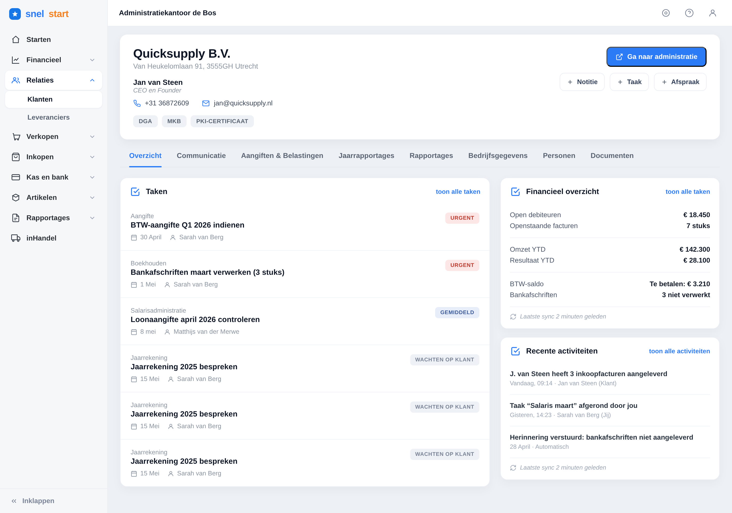
The relation overview for accountants — fiscal tasks and financial health
FOR THE ACCOUNTANT · FISCAL & FINANCIAL HEALTH

Built for control.

The accountant opens the same relation and sees deadlines, tax returns and the client’s financial health — everything needed to stay in control across a whole portfolio.

  • A task list around deadlines: BTW-aangifte, loonaangifte, jaarrekening
  • Dedicated tabs for Aangiften & Belastingen and Jaarrapportages
  • Financial health at a glance — omzet, resultaat and BTW-saldo YTD
  • Status tags — urgent, waiting on client — to manage the portfolio
KEY PRODUCT DECISIONS

The calls that shaped the page.

Decision 01

From modal to full page

A pop-up couldn’t hold a relationship. Promoting the relation to its own page gave the content room to breathe — and space for insight, history and context alongside the editable data.

Decision 02

Insight before detail

The page leads with a read on the relation — key figures, status and financial health — so the important story lands before the raw data.

Decision 03

Domain tabs, no detours

Invoices, quotes, activity, aangiften and reports come to the relation as tabs — users get the full picture without ever leaving the page.

Decision 04

One foundation, two audiences

The overview is a framework, not a one-off screen. The same foundation flexes from an action-driven ondernemer view to a fiscal accountant view — and can absorb new needs like KYC, fiscal entities and future ventures without a redesign.

DISCOVERY & COLLABORATION

Mapped with the team, not in a silo.

Discovery sprint — mapping the relation across snelstart with the team
Discovery sprint — mapping the relation across snelstart with the team.

Before any screens, I ran a cross-functional discovery sprint — bringing stakeholders together to map everything a relation touches across snelstart and the jobs different users come to it for. We worked it out on the wall with canvases and journeys, aligned on scope and priorities, and turned that shared picture into the direction for the design.

Cross-functional stakeholders Journey & needs mapping Aligned scope & priorities
THE JOURNEY

How it came together.

01 · Map
Audited everywhere a relation appears across snelstart and gathered the jobs users came to it for, from quick lookups to chasing payments.
02 · Structure
Shaped an information architecture that led with insight, then organised the rest into clear, scannable domain tabs.
03 · Design
Prototyped the overview fast in Figma — insight cards, recommendations and tabs — iterating on the layout with the team.
04 · Validate & ship
Validated the direction with users, refined the details, and shipped the new relation overview into the product.
THE OUTCOME

Live in snelstart — and doing its job.

Live · shipped to users, replacing the old modal
+35%
More usage of the relation screen

Users now open and act on the relation far more than they did with the old modal.

+22%
Onto insight-rich packages

More customers move up to higher tiers for the extra insight and advice.

+14
NPS lift after release

Satisfaction with the relation experience rose notably once the overview shipped.

~40%
Faster to a full picture

Less time from first click to the full context of a customer.

Everything about a customer, finally in one place — I don’t have to go hunting across screens anymore.
— SnelStart user, validation round
Proactive, on-brand

Late-paying customers are now flagged up front — turning data into the advice SnelStart’s mission is built on.